
Manchester Transit Authority
Connecting a legacy transportation agency with modern audiences.
Logo Design & Bus Wrap-
Design lead
-
Logo design, motion graphics, bus facade, presentation
-
Illustrator, Photoshop, After Effects

Brief
The Manchester Transit Authority serves as the public transportation system of Manchester, New Hampshire’s largest city. The MTA represents a ridership of nearly 500,000, making it also the largest and most far-reaching public transit option in the region. Since its inception in the 70s, the MTA had utilized the same brand - they needed something fresh to keep up with their evolving identity. The MTA ran a challenge with local colleges to introduce an updated brand that would attract new audiences and promote public transit as a reliable option.
Concept
Out of more than two dozen applicants, my pitch was approved, and the logo and bus facade that I designed were chosen to represent the MTA.
Prioritizing a modern, minimalist visuals approach created a brand that is easy to recognize at a glance and stretches the taxpayer’s dollar farther. Clever visual references in the logo and brand design reinforce the MTA as a smart choice for transportation.
“It’s striking how much more modern and inviting the new design is ... We’re redesigning our service to [meet regional needs], and this rebranding helps to demonstrate that metamorphosis.”
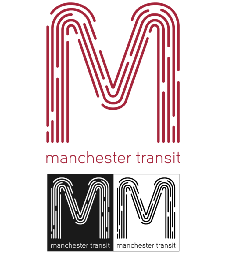
Logo Design
The logomark has been designed to hint at motion, resembling lines of moving traffic. It is energetic, bringing the vibrant and updated feel the MTA sought.
Dropping the word “authority” from the visual also creates a more approachable feel, while the red still communicates a strong, dependable tone.
The new logo offers flexibility for all kinds of use cases. It is optimized for any size or colorway, static or dynamic, digital or print.
Bus Facade
The new exterior is simple but striking. The red busses are highly visible, even in New England’s snowy winters.
The design also fulfills a major request from the client: cost-effective application. The paint job can be accomplished through in-house efforts.


